
Never mind the b*ll*cks, here’s the Moodle Atto text editor. Or, don’t hold your readers to ransom.
The developers at Moodle HQ have taken the lead in the design and presentation of accessible, web and mobile-friendly learning content. The new current and now well established text editor is aimed squarely at creating content for a diverse community of learners with a range of needs, and who use a growing number of devices, operating systems, and browsers to create and access content. It is designed to be lightweight, platform agnostic, and to assist in the creation of accessible content.
Reading on the screen is very different from reading printed materials, and content creators have a number of issues to consider when writing for an online audience. These include the following:
Web users scan rather than read content.
- Anything which interrupts that process can undermine the communication process, and should be avoided.
- Examples of distractors include multiple fonts, ever-changing font sizes, and in-line links.
Not all users perceive colour in the same way.
- Using colour to convey meaning can discriminate against users with colour-blindness by making it harder for them to access, understand, and act upon information presented in this way.
- Content should be produced with future as well as current users in mind, and is better to make content accessible now than to make adjustments on demand later.
- Offering a range of background and font colours can often result in illegible combinations, or combinations which may not work after future upgrades to our Moodle site.
Not all users consume content in the same way, some users:
- may access text-only versions of a web site, and any meaning conveyed through typography will be lost.
- employ their own ‘style sheet’ to make the necessary adjustments to online content.
- consume online content with screen-readers, and anything which ‘bloats’ the text with underlying code (HTML colour, font and size settings, for example) can affect the performance of assistive technology.
Mobile users demand speed; mobile browsers demand lean content
- 25% of visits to our Moodle VLE are made on a smartphone or tablet
- The ‘bounce-rate’ – where web users land on a site only to leave immediately – for mobile device users on Moodle not long ago was 35%.
- We have taken steps to improve the mobile experience, and this includes improving the presentation and readability of content.
- Using text hierarchy provides content with a clear and strong structure, one which downloads quickly.
- Overly styled content is less robust and may be handled differently by different platforms, devices and browsers
The Moodle text editor therefore does not have all the tools you may find in, for example, Microsoft Word. It no longer offers a range of fonts and colours. It instead allows editors to present content with a clear hierarchy, in the form of headings of various sizes and strength, and paragraph text. The latter can be bulleted and emboldened.
Text can also be italicised and underlined – although, when used liberally, this can erode the ‘readability’ of a text.
But wait….
Our Moodle theme comes with mobile-friendly, platform agnostic, design elements.
Tabbed navigation
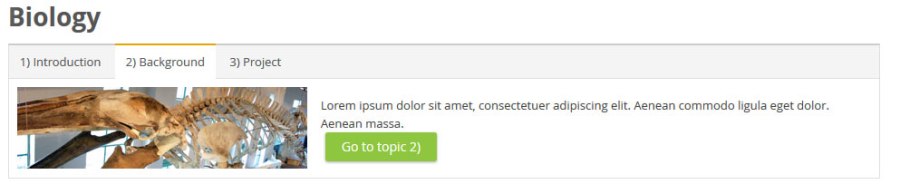
Course banners and topics

You can find out more about this by reading the Custom theme documentation. The tools have been used in several Moodle courses, for example Using Turnitin Feedback Studio.